Do you know which parts of your emails engage recipients the most, or which elements should be revised or removed? If not, explore the click map in your email campaign statistics.
In this blog post, we’ll share with you how the click map helps make emails more appealing to subscribers and how to use it in NiceSender to achieve better email marketing results.
Table of Contents
What is a Click Map, and How Does It Enhance Email Campaigns?
A click map is a convenient visualization of recipient activity within your emails. It shows the number and percentage of link clicks in different elements such as headers, CTA buttons, images, and text.

The click map helps you understand which designs and elements catch up the attention of your subscribers.
With the click map, you can:
- Identify the most clickable elements in your email.
- Determine the elements that subscribers ignore.
- Discover audience interests, such as products or headers received the most engagement.
- Generate hypotheses to test them for improving conversion rates.
- Enhance template design: button colors, fonts, element placement, etc.
The click map is a marketing tool that reveals which elements of an email capture the most subscribers' attention. Analyzing clicks can notably enhance the effectiveness of email campaigns.
How the Click Map Helps Improve Campaign Results
To boost the email marketing effectiveness, you may need to formulate hypotheses and test them. The click map is a useful tool for testing hypotheses and improving the CTOR (click-to-open rate).
Let’s see an example of how analyzing the click map can enhance campaign metrics.
The ‘Sun’ company regularly sends emails with article announcements to its subscribers. The hyperlinks are placed on buttons below the articles descriptions.
Hypothesis: Adding links not just on buttons but also in article titles and images will increase blog traffic.
To test the hypothesis, send the next email, placing links to the articles on buttons, in headers, and images.
Upon analyzing the click map, we found that subscribers click on headers three times as often and click images just as frequently as the action buttons.
Solution based on the click map: add links to articles on action buttons, in headers, and images.
As a result, the number of clicks increases, the audience engages more actively, and traffic to the site grows.
Click Map in NiceSender
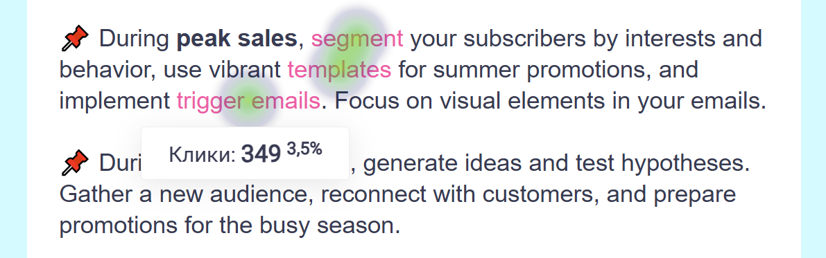
The click map in the statistics of NiceSender allows you to see the number of clicks on all links in the email and the percentage for each click. It shows which elements of the email attract the most attention and actions from recipients.
The click map also shows the email addresses of subscribers who clicked on the links. This allows you to identify individual audience interests and personalize your campaigns.
For instance, you could send an additional email to active users and exclude inactive ones from future campaigns.
Where to find the click map for your email campaign and how to work with it in NiceSender
1) Log in
Go to your NiceSender account.
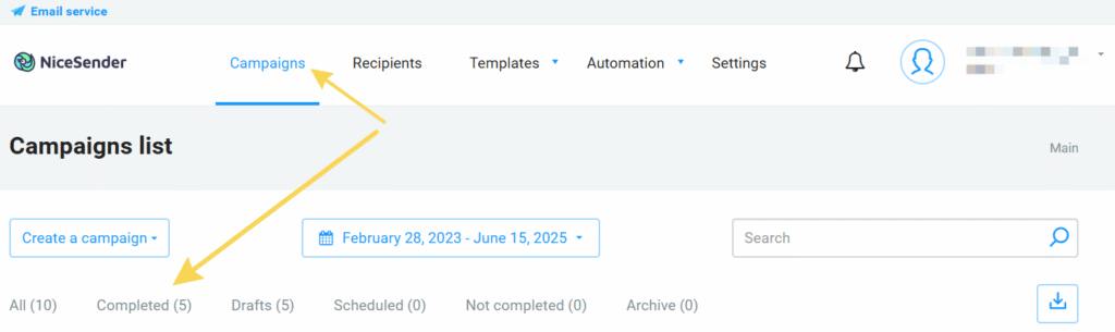
2) Select the campaign
Open the completed campaign you need: Campaigns → Completed.
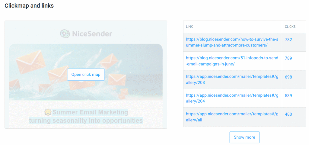
3) The “Click Map and Links” section in the campaign statistics
Find the “Click Map and Links” section in the campaign statistics.
Here you can see a general list of all the links in the campaign and the total number of clicks for each one.
If you click on the number of clicks for a link, you will see a list of email addresses of subscribers who clicked on that link and the number of their clicks.
You can also use the search bar to find out if a specific recipient clicked on that link in your campaign.
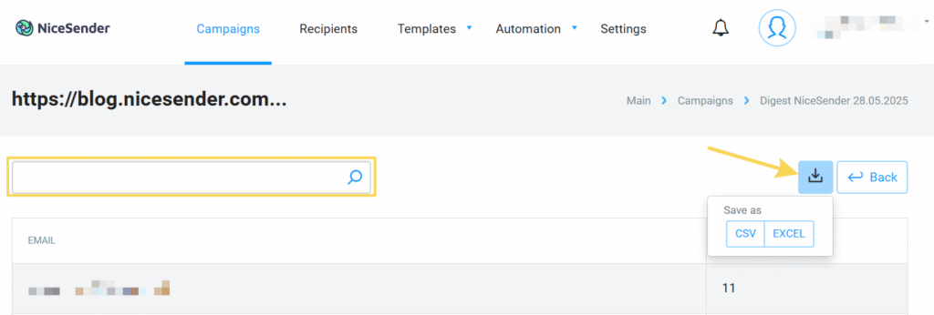
The click map statistics can be exported as a report in CSV or Excel format for further detailed analysis.
4) Overview of the click map
Click ‘Open Click Map’ to view a heat map of link clicks, where warmer colors indicate more activity.
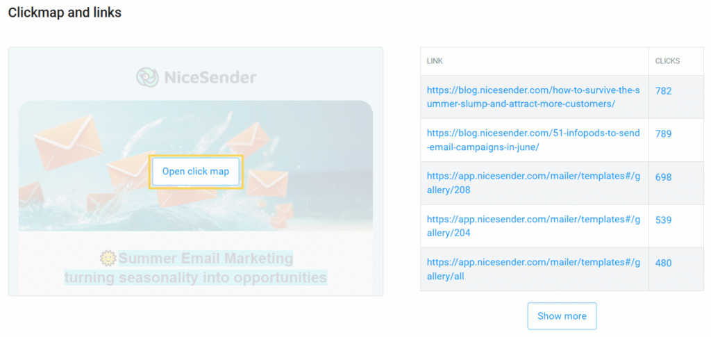
You can check the click statistics for each link.
5) Analyzing the Click Map and Generating Hypotheses
Identify which elements received the most clicks. By analyzing these statistics, you may hypothesize that changing the button color, rearranging blocks, or adding more links could enhance engagement.
Proceed to test these hypotheses.
6) Testing hypotheses
Implement A/B testing to validate your hypotheses and refine your campaign metrics. Either run an A/B test on a segment of your recipients, or use two campaign versions across your entire database to identify the most effective elements.
A/B campaigns enable you to automatically test variations of your email with 10-30% of your recipients, then send the most effective version to the rest of your audience.
With A/B campaigns, you won’t have to start separate campaigns to find out their effectiveness. This is important when the number of sent emails affects the cost of your campaigns.
For more comprehensive insights, distribute two versions of the email across your entire recipient base and analyze the comparative click maps.
Conclusion
Leverage insight from NiceSender’s click map to maximize engagement in every campaign. This tool enables you to:
- Understand and anticipate your audience’s preferences;
- Customize content to align with your clients’ interests;
- Focus on effective email elements that drive your objectives;
- Boost CTOR, engagement, and sales.
Review the click map for your recent campaigns in NiceSender today.